May 9, 2025
4 minute read

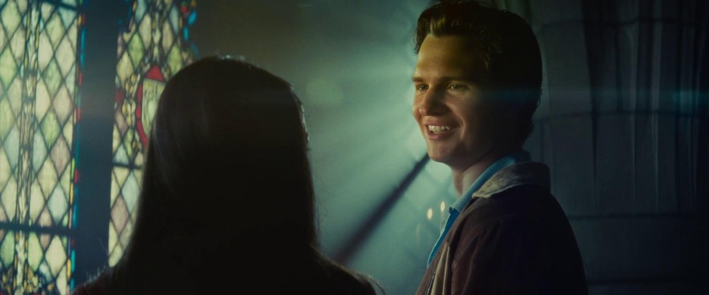
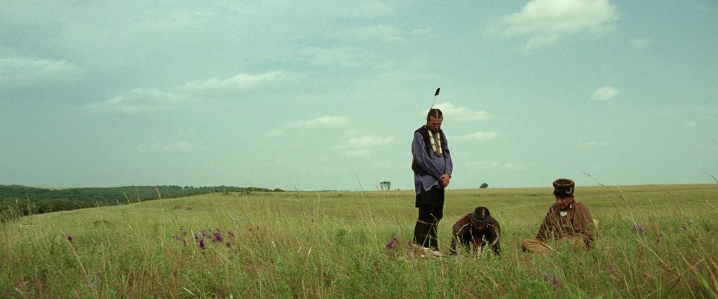
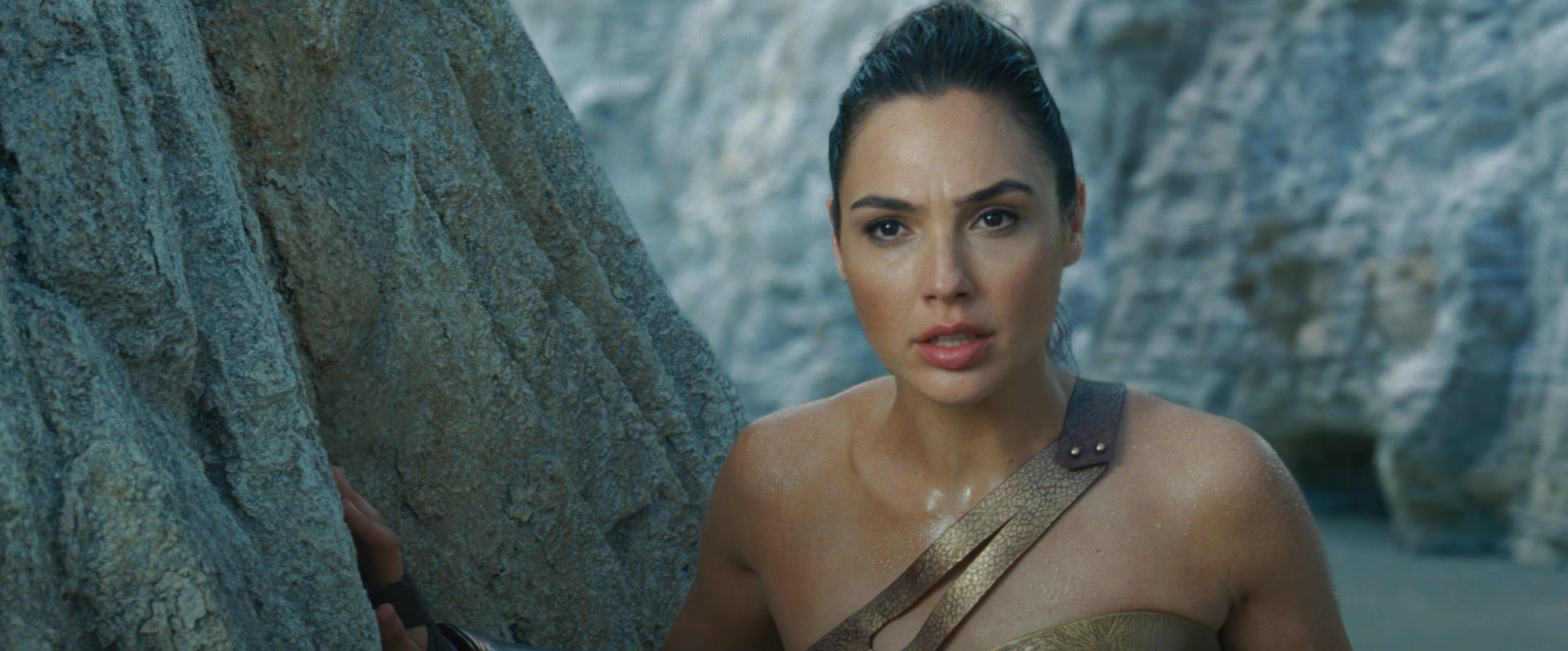
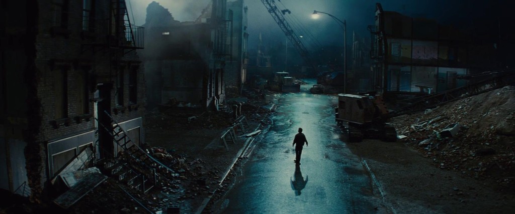
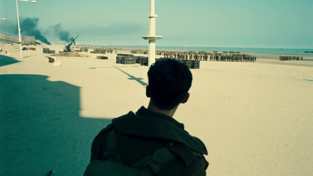
Buckle up, color enthusiasts, because we're diving headfirst into cinemas' favorite color contrast! Fire and water, warm and cool. It’s a tale as old as time, but for filmmakers, the blue end of the spectrum is shifting ever so slightly green, and it’s happening to your favorite blockbuster hits year after year.
Today we’ll explore the reasons for this teal shift and the surprising psychology behind its popularity.
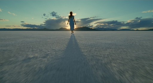
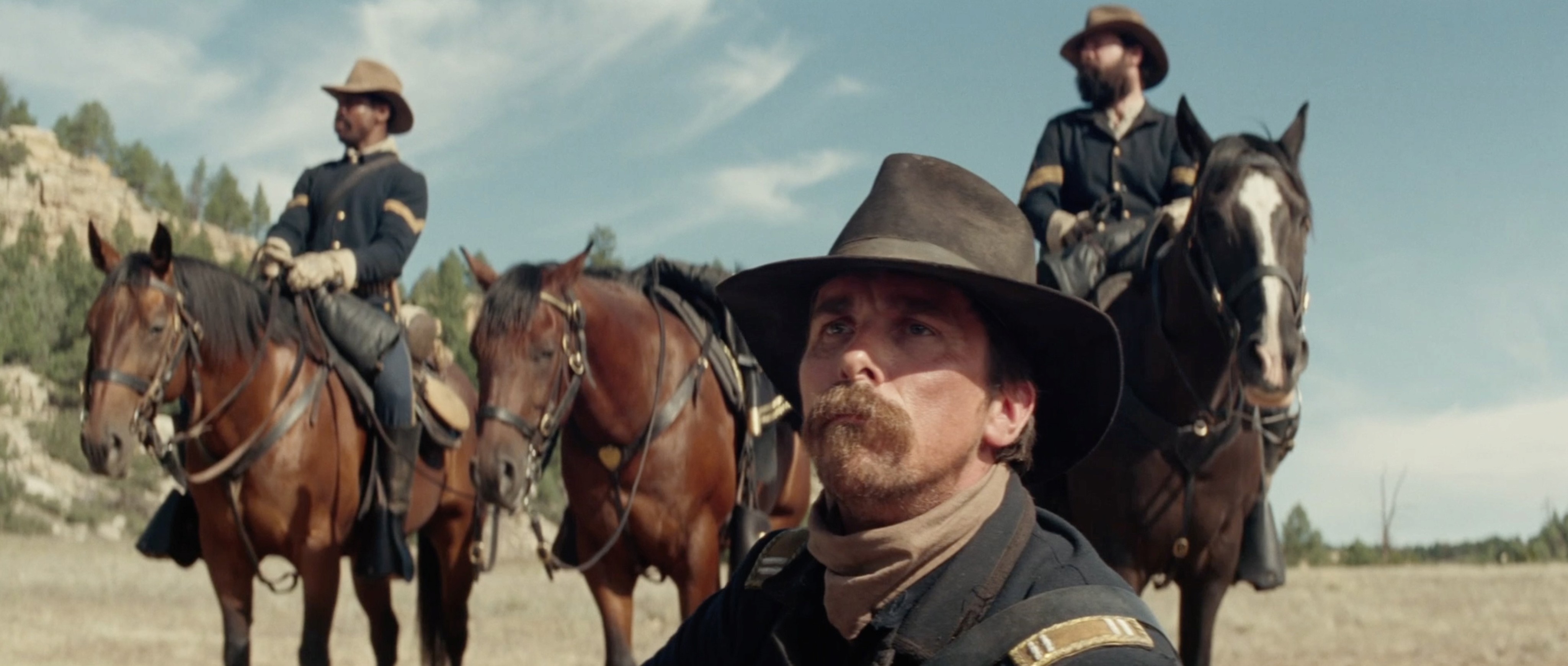

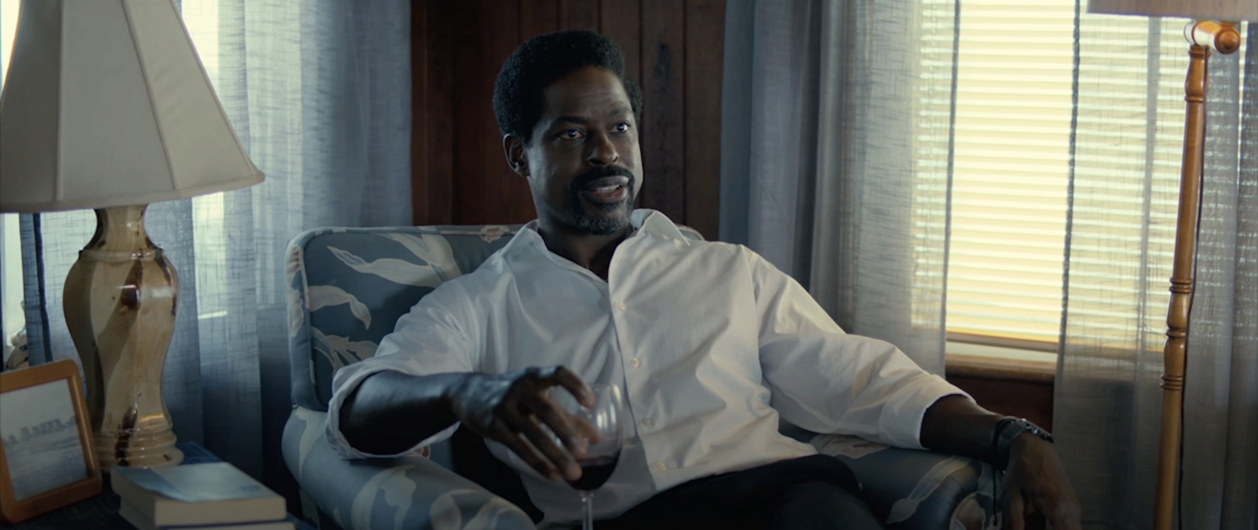
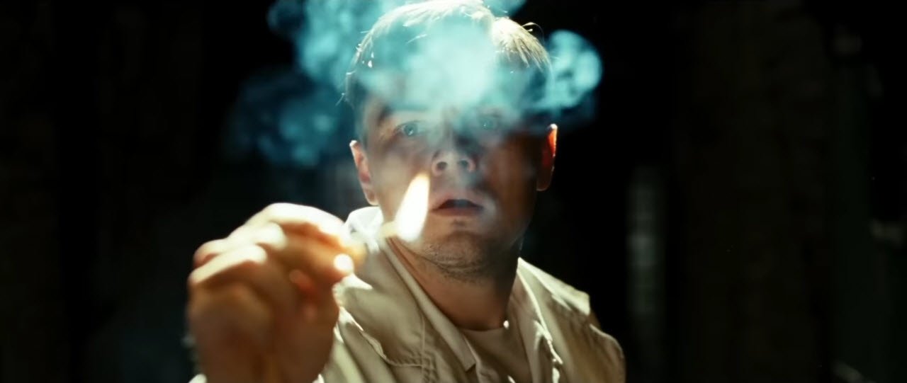
Nature's influence
Golden hour, that magical time occurring twice a day, happens when the sun hangs low on the horizon. During this enchanting period, sunlight filters through more of the atmosphere, transforming into a warm, golden glow.
Meanwhile, the sky, radiating a cool ~6000 Kelvin, appears strikingly blue. This beautiful interplay between warm and cool hues is what makes golden hour so captivating.
For the 300,000 years humans have walked the Earth, we have become highly accustomed to observing light that falls within this normal color temperature range. However, common natural disasters such as forest fires can cause a smoky atmosphere that filters sunlight making light appear more red than usual.

Just like a smartphone camera adjusts for lighting conditions, our brain naturally modifies how we perceive colors. As our brain attempts to white balance and counteract this red shift in sunlight by introducing green, we experience the sky appearing more green than usual as shown below.
The image on the bottom left is a realistic depiction of the red sunset I witnessed after a nearby forest fire.
The image on the bottom right simulates how the brain attempts to acclimate to this unusual red lighting by green-shifting. This is a rare occurrence where you can experience the illusion of a teal sky in nature.


Considering the relatively rare occurrence of teal light in the natural world, how is it that its use is so popular in cinema? The answer can be found in colorists' desire to maximize chromatic contrast in images.
Chromatic contrast
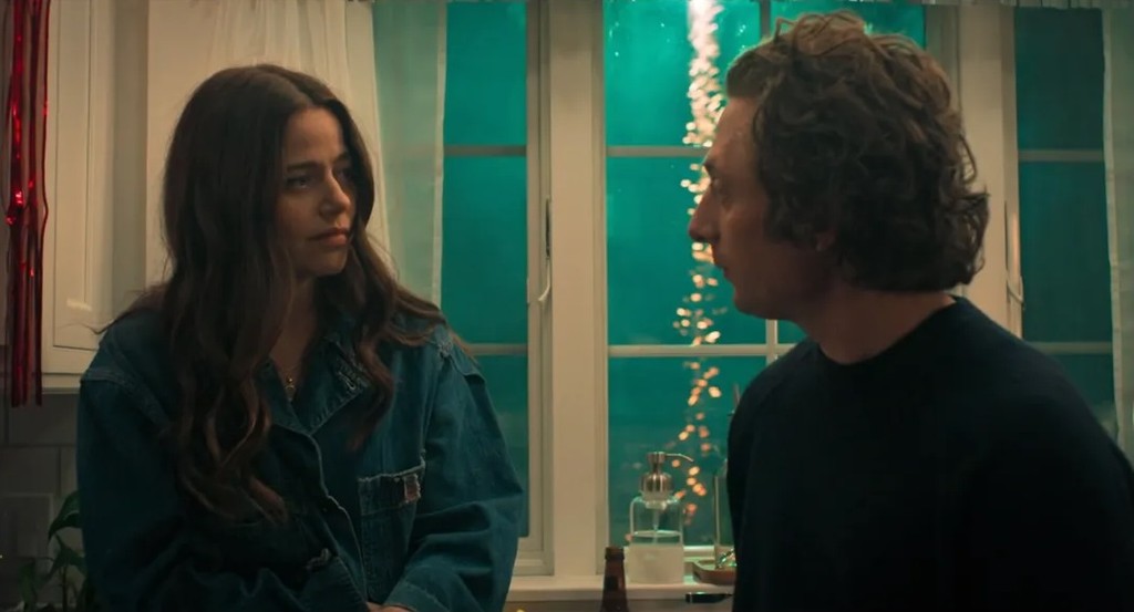
Colorists have the power to guide the audience's attention by introducing contrasting colors that make the focal points, typically the actors, stand out in a scene.
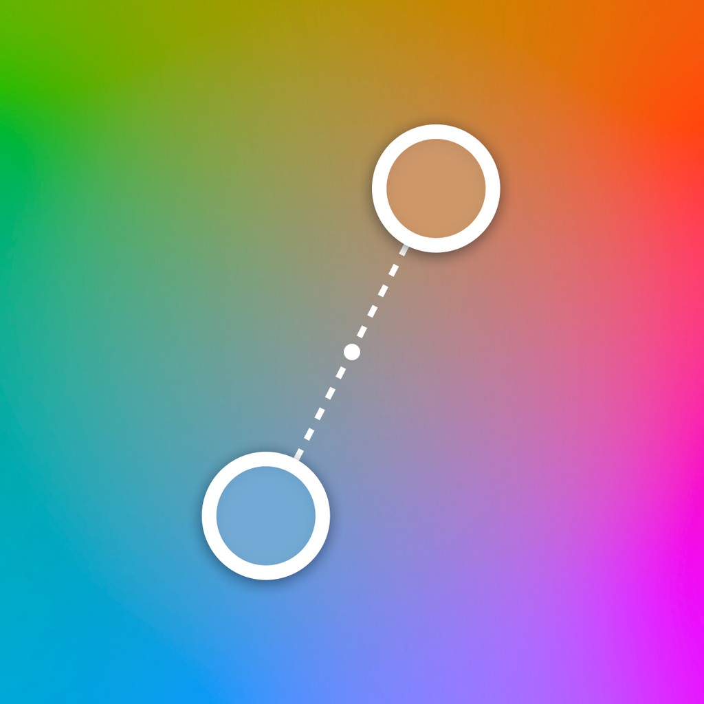
Skin tones, which fall in the orange spectrum of light are naturally contrasted with blue or teal. Many filmmakers claim that the popularity of teal and orange is due to teal being the complementary color to orange.
Surprisingly, this is not entirely true. According to modern color science, the polar opposite hue of skin tones have much less green than you might expect…
Palette simplification
The work of a modern film colorist is more often than not impressionistic. Each film strives for a defined look, either to align its marketing with relevant popular films or to support the story’s themes. It’s easy for colors to clash when every hue is fighting for your attention. To achieve coherent visual threads, colorists seek to simplify the complexity of the color palette on screen.
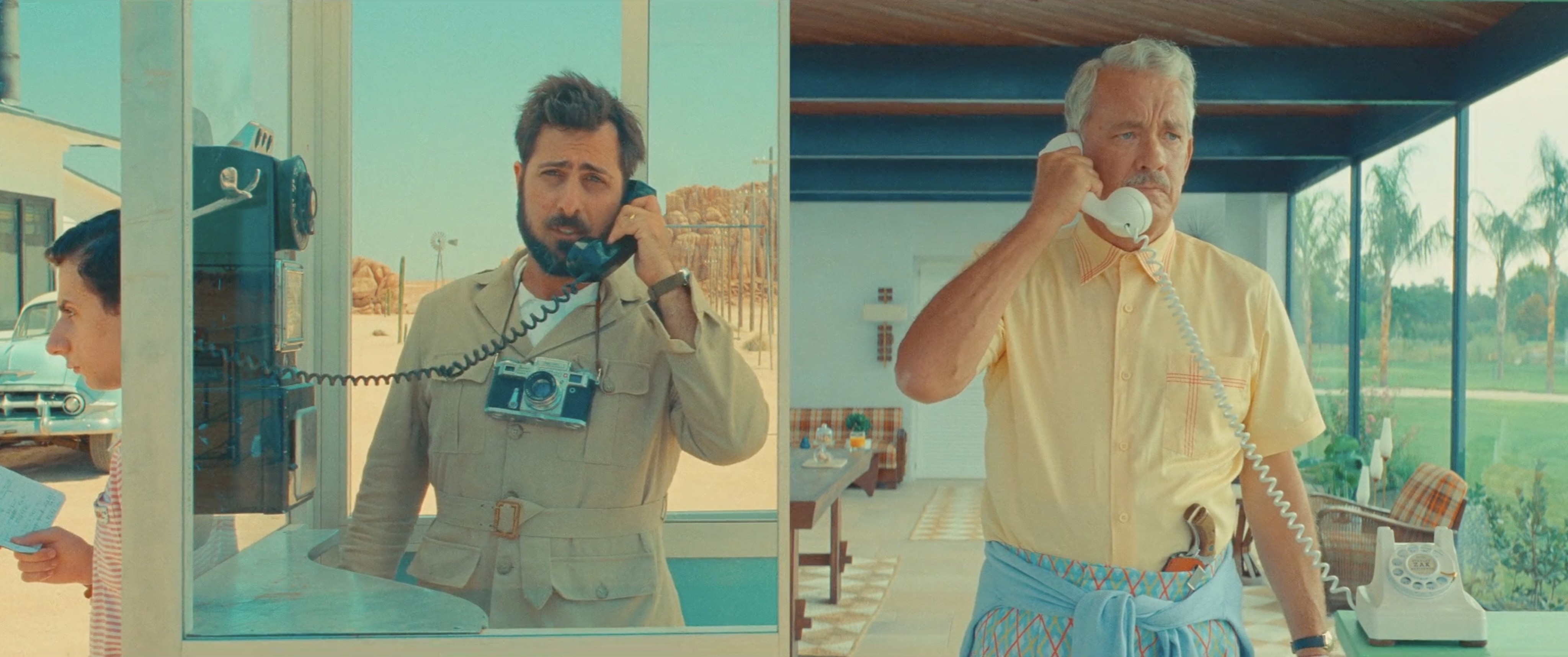
Plants are all around us and often in movies as well. The green hue of most plants can be shifted toward blue to create a stronger chromatic contrast with skin tones, but only to an extent. When plants are too blue, the unnatural look can become a distraction.
Another common color in nature is blue. While this color already holds the strongest chromatic contrast to skin tones, it can be shifted towards green to more closely match the color of blue-shifted plants.
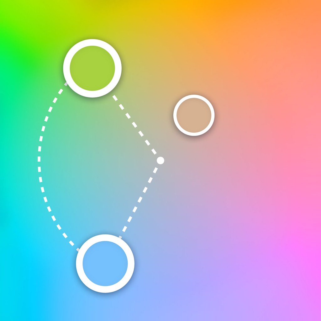

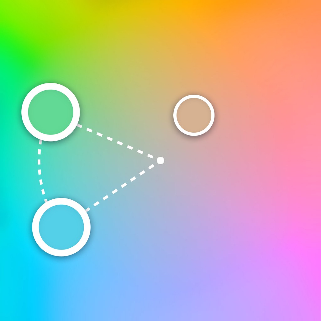
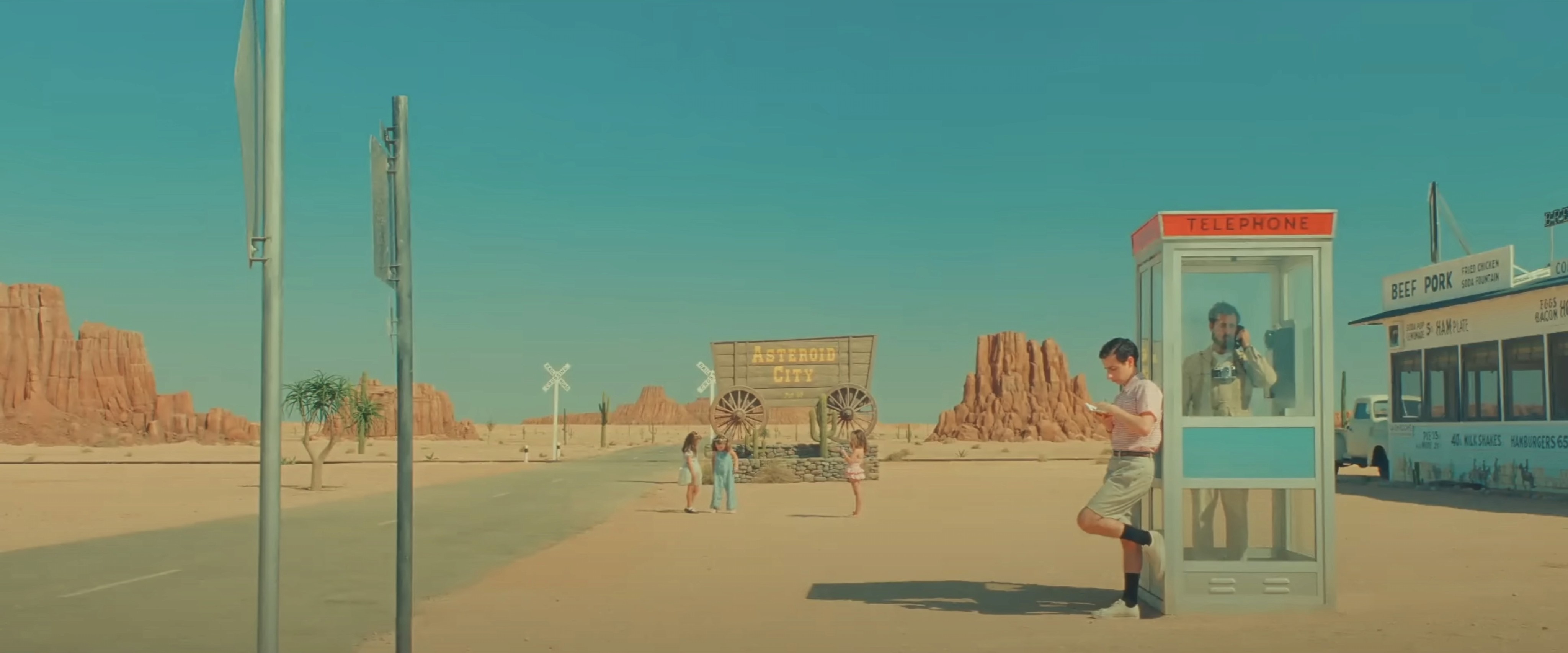
After unifying these two colors, the result is a more focused visual identity. Notice the grass and foliage in this shot from Wes Anderson’s Asteroid City.
Garbage in, garbage out
This effect is best captured in camera through varying color temperatures in lighting. A dynamically lit scene is perfectly staged to convincingly shift the hues of blue to teal. In other words, it helps to already have blue in the scene to begin with. Critiques of this look often point to examples where tone mapping is used to artificially add color contrasts to a chromatically flat image.
Colorblind friendly
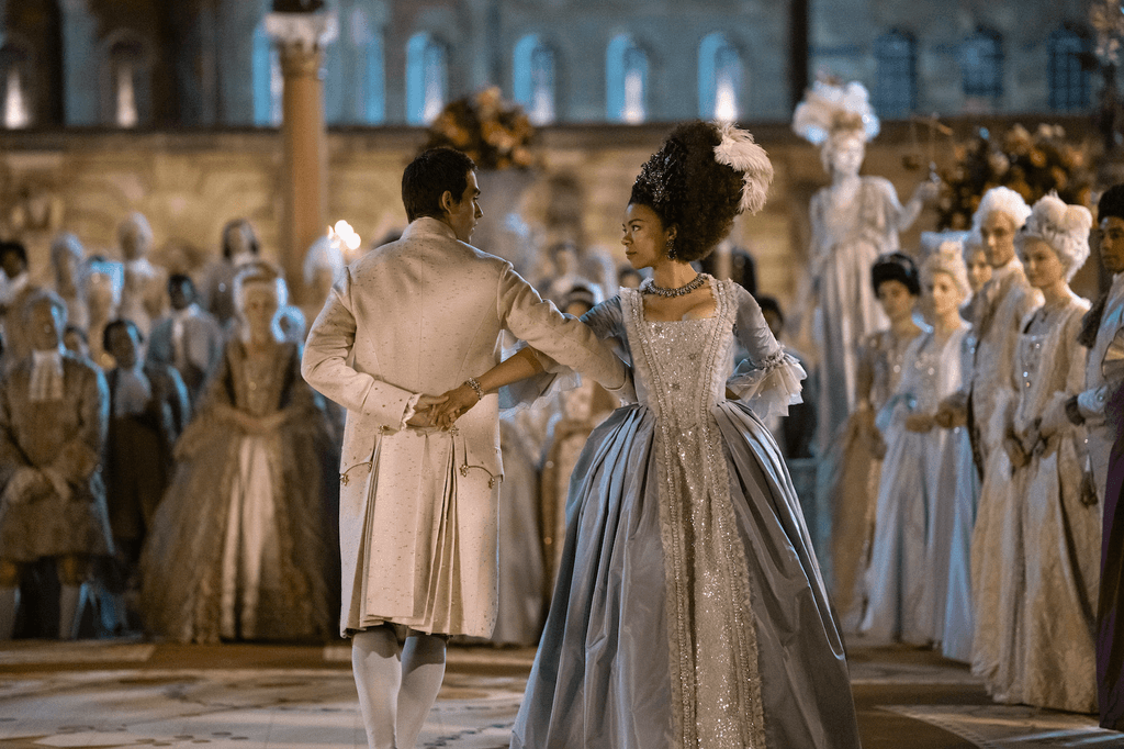
Under the lens of common color deficiencies, teal and orange holds up. Most types of Colorblindness result in the inability to distinguish between green and red. The duotone nature of teal and orange is naturally more narrow in gamut and so the effect of green-red color blindness is relatively minimal on these images.
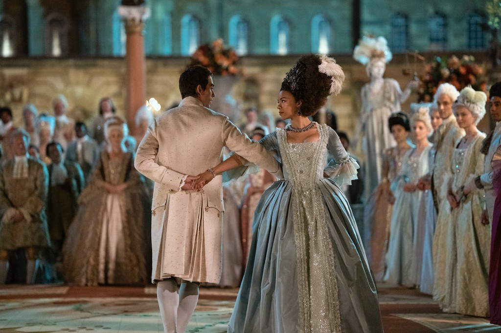

Normal vision
Deuteranopia
color blind
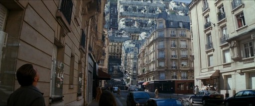
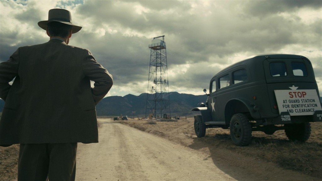
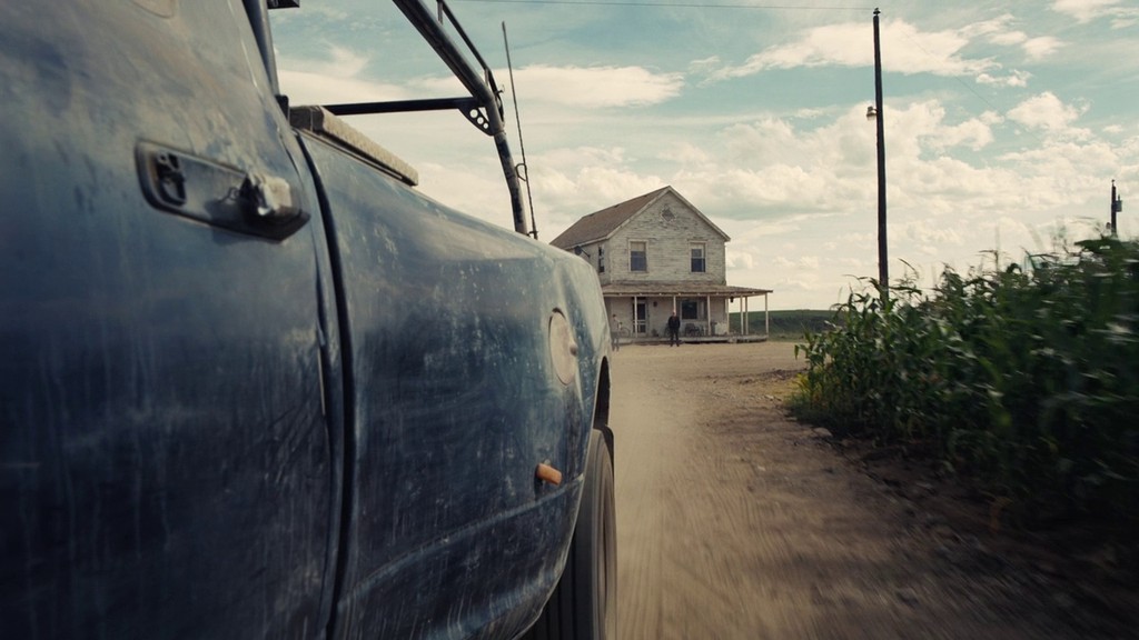
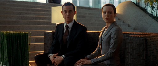
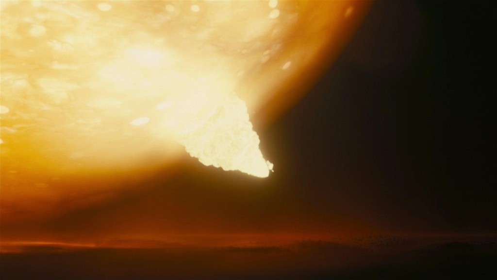
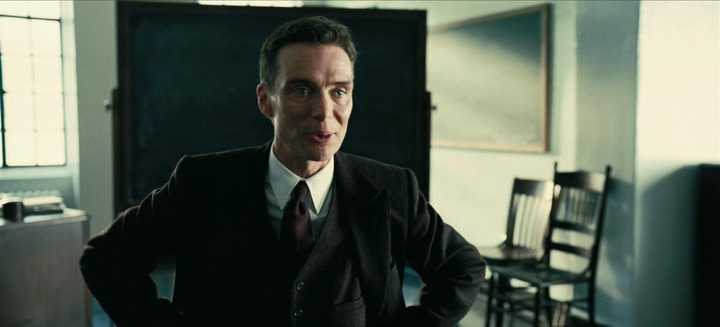
Approximately 8% of Men and 0.5% of women are colorblind. Christopher Nolan, Director of Oppenheimer, Inception, and the Dark Knight is known to be red-green color blind. Naturally, the color schemes of his movies mirror the gamut of color through which he sees the world.


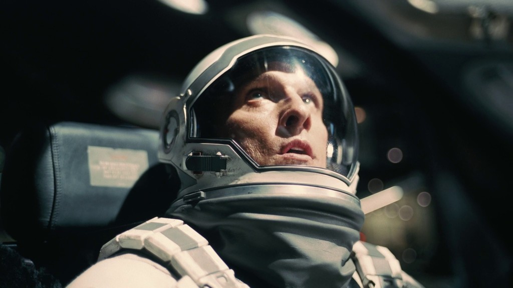
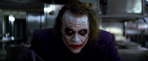
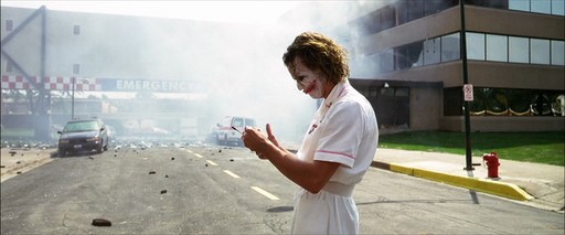
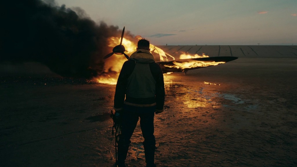
A need for simplicity
By way of example, let’s assume there are 100 unique colors you can work with. If your on-screen palette can consist of up to 5 uniquely different colors. Mathematically that’s 79,263,495 distinct color palettes.
In practice, there are near infinite unique color schemes you can work with for your movie. For many, this can be overwhelming and so there is a desire to boil down color theory to one simple repeatable formula, and this need for simplicity continues to fuel the teal-orange look to this day.

To cap things off, I was inspired to take a selfie with my own teal-orange-esque color grade featured above. Edge lit with a warm 3,200K Aputure LS 60x.
If you found value in this article, please take a moment to share it with a friend! We're here to demystify the infinitely vast world of color, one blog at a time.
Love teal and orange? At Hoppn Labs, we patented Infinite Color Search, an innovative way for shoppers to find an exact color product on a website. For Shopify store owners, transforming your site into a color-search paradise takes just minutes. Install Hoppn’s user-friendly, no-code Shopify plugin today!

Similar articles


